La Esperanza de...

Book design for writer Benjamín Caro Morales.
"La Esperanza de..." ("The Hope of.." in Spanish) is a deeply human historical novel that intertwines love, memory, and political struggle during one of the most turbulent periods in Latin American history. Written by Benjamín Caro Morales and published in April 2026.
Client
Design of the book
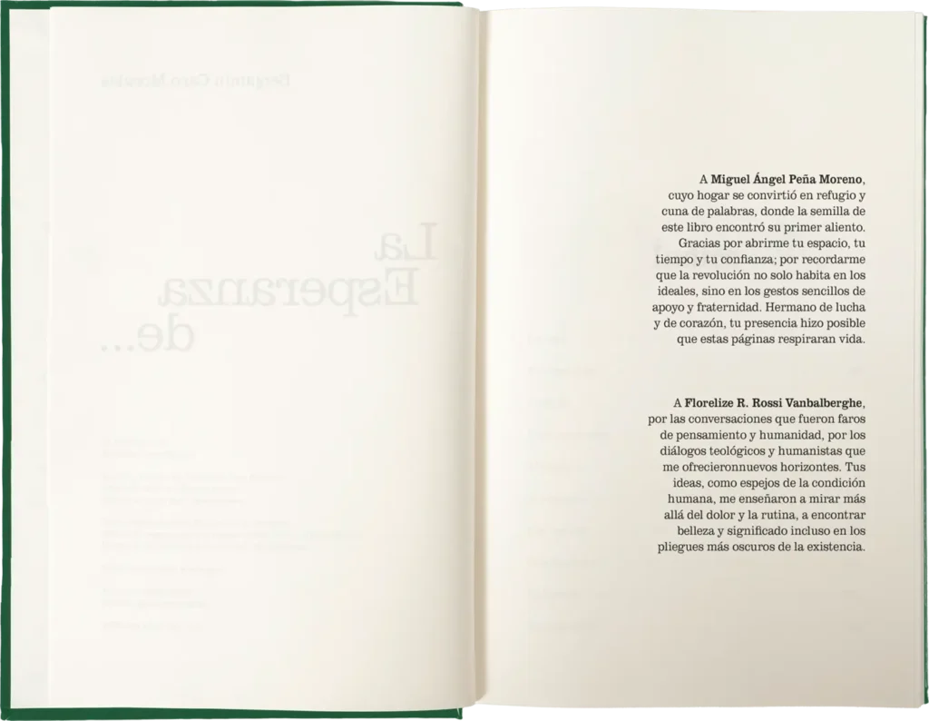
The novel tells the love story of Raúl and Amanda. Amanda disappears following the Chilean coup d'état, and Raúl crosses numerous physical and emotional borders during his search, which is shaped by the political climate of the second half of the 20th century.
The visual concept for the book was to create press clippings inspired by publications and articles from that era, directly linked to the events recounted in the novel.
During the research phase, typography and layout styles used in specific countries and periods were collected. These references served as the foundation for reconstructing the clippings and inspiring the interior layout design.
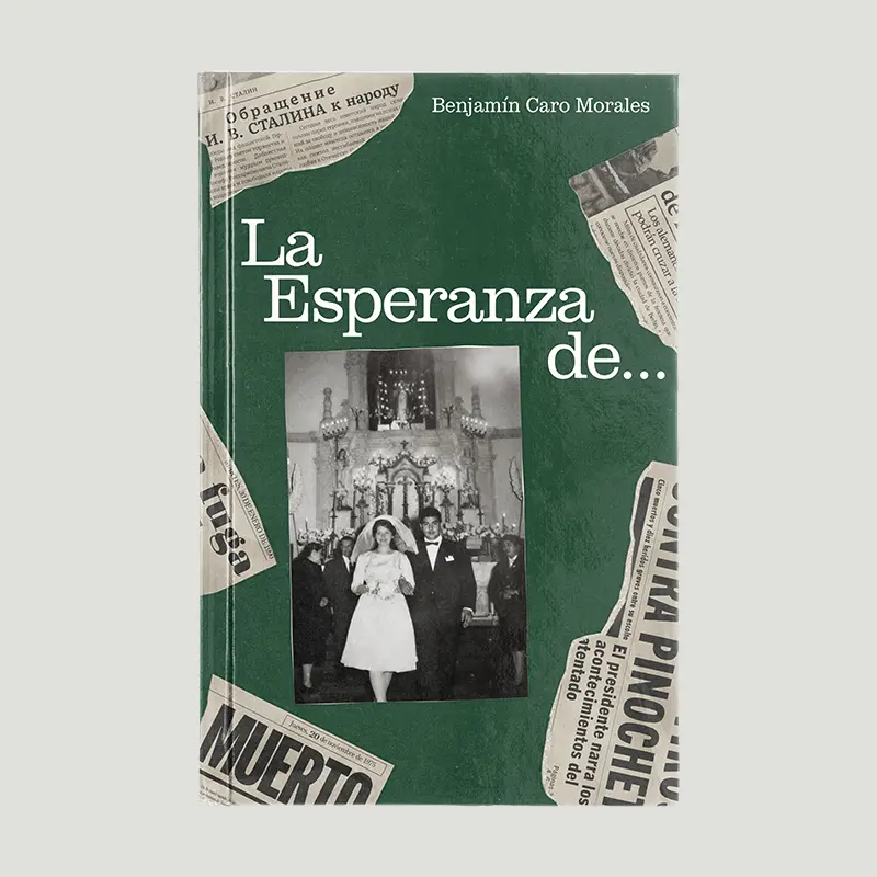
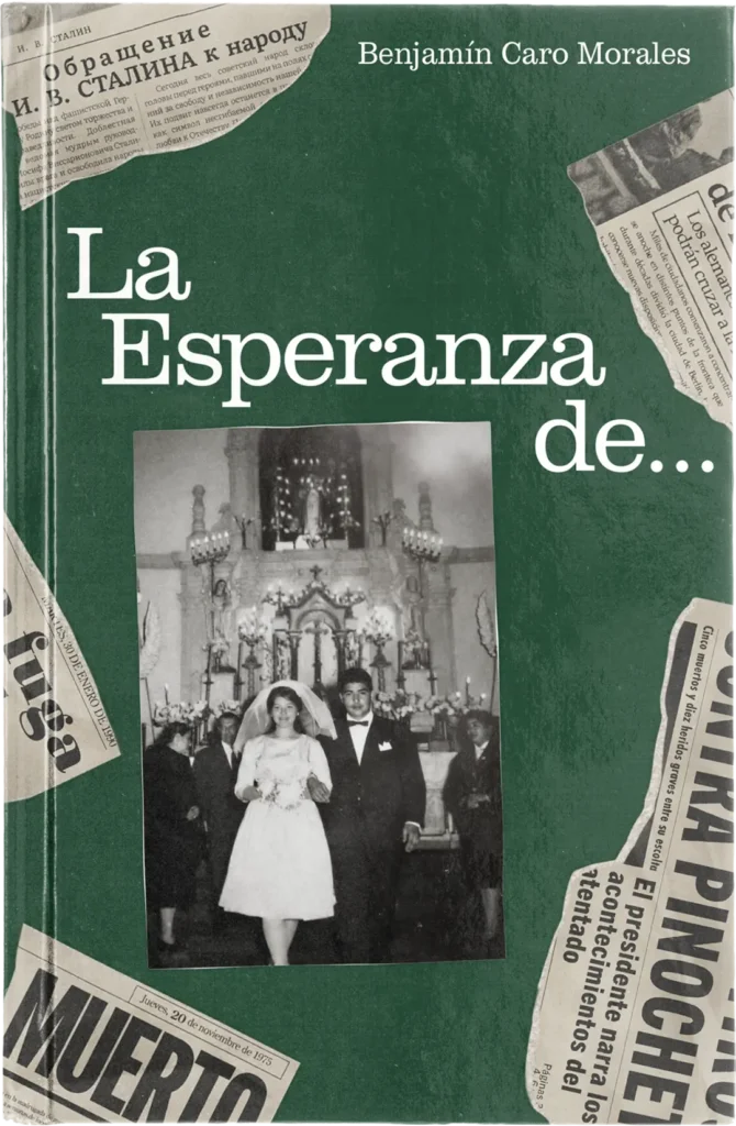
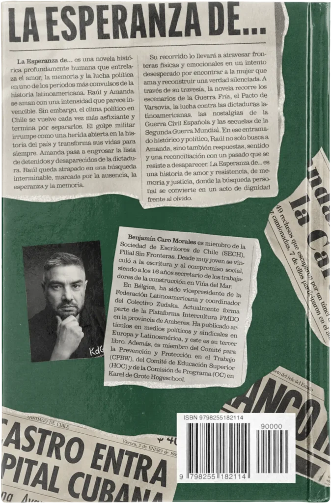
The front cover features a photograph from the author’s family album, showing the protagonists' wedding. The image is surounded by press clippings that wrap around the cover. The title and the author’s name use the Clarendon typeface, chosen for its use in Cuban newspapers of the period.
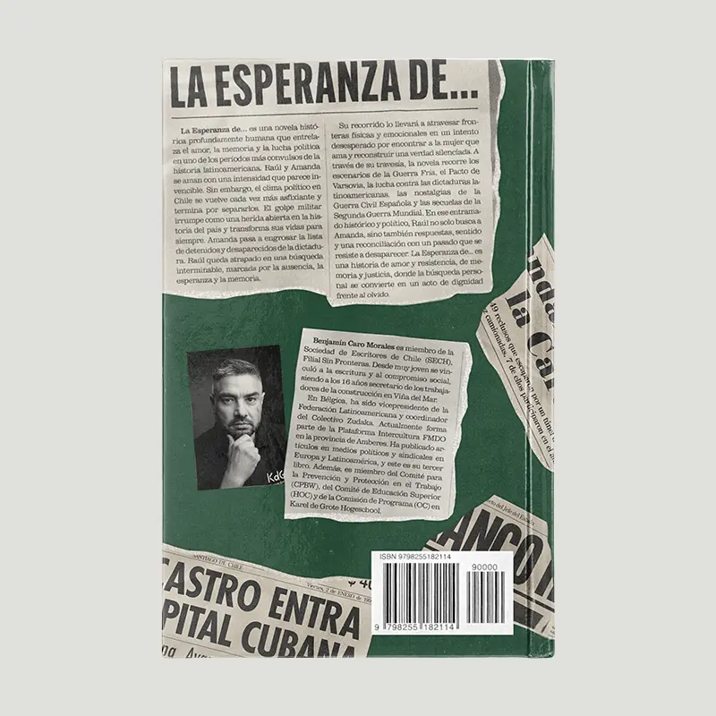
On the back cover, the book's blurb and the author's profile receive the same treatment as the clippings, integrating them while respecting the visual concept.
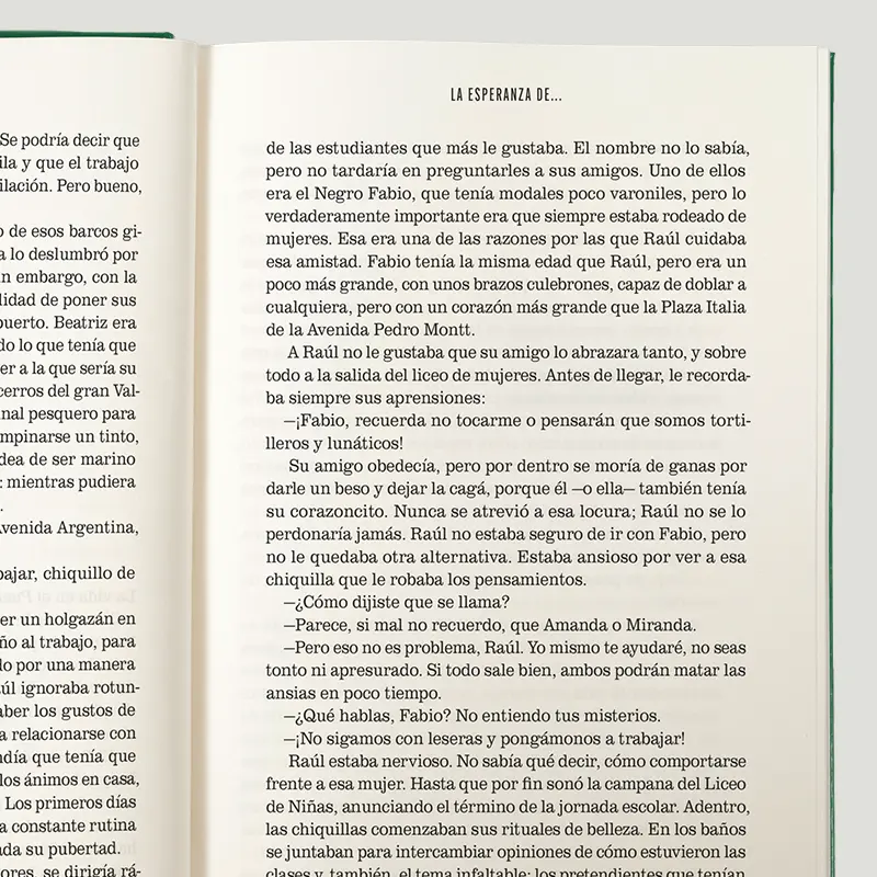
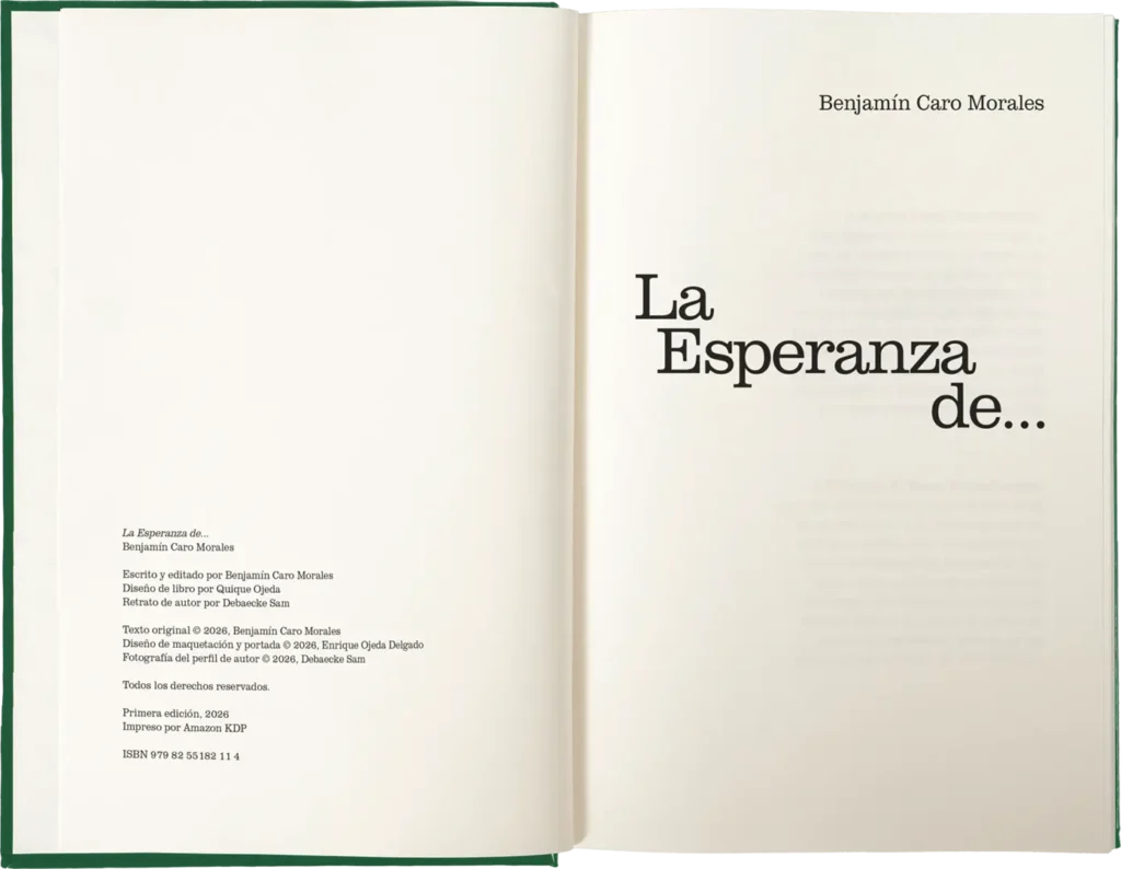
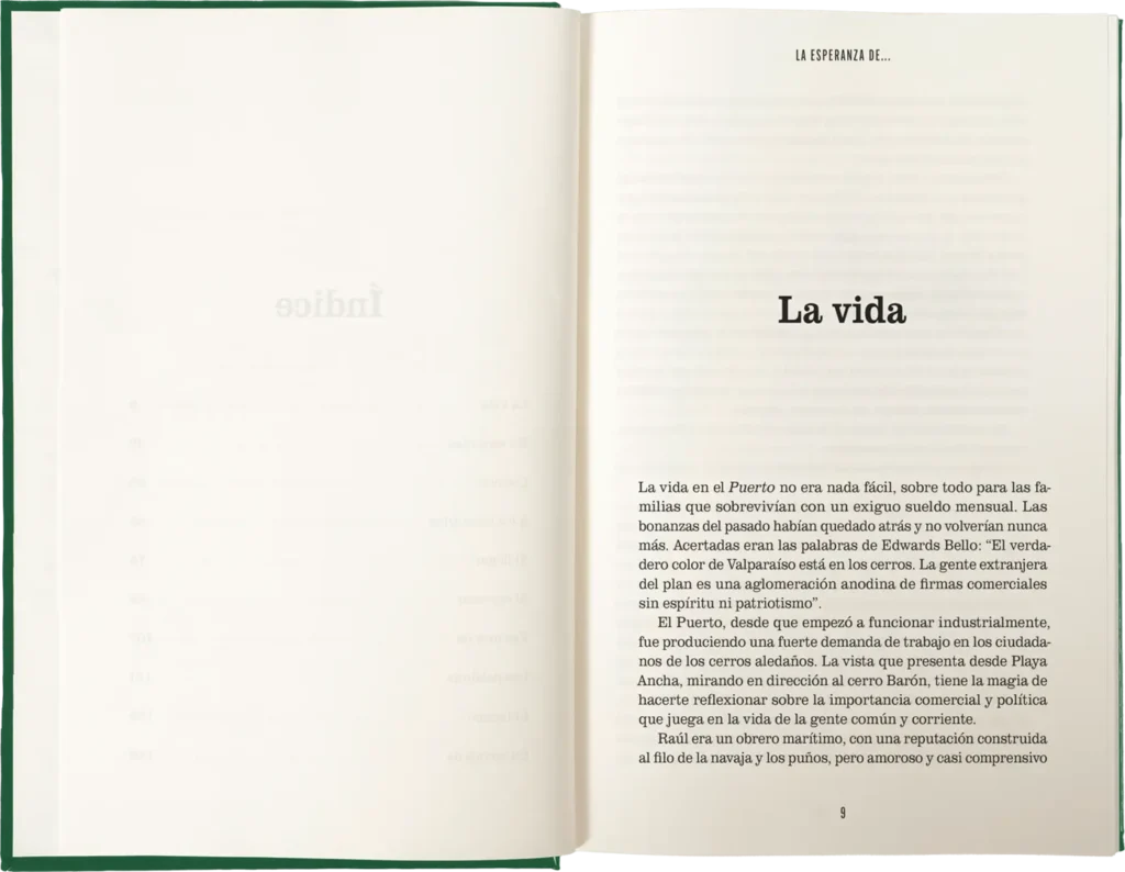
The interior layout design reinterprets newspaper influences, also using Clarendon for the text while maintaining the legibility and cleanliness required of a contemporary publication. For the markers and page numbering, Alternate Gothic was used, a typeface based on the gothic styles found in 20th-century newspapers.
Credits
Original text: Benjamín Caro Morales
Editor: Benjamín Caro Morales
Book designer: Quique Ojeda
Author's portrait: Debaecke Sam
Related projects